

Most digital products feel the same. Same layout, same color palette pulled from a design system, same empty states with a sad cloud illustration. It works — until you want people to actually remember you.
A brand mascotis one of the oldest tricks in brand building, and one of the most underused in software. Duolingo's owl, Mailchimp's Freddie, the Michelin Man — these aren't just logos with faces. They're characters that carry a brand's personality, make it instantly recognizable, and create emotional connections that a wordmark never could.
If you're building an app, SaaS, or ecommerce brand and wondering whether a mascot makes sense for you — this guide breaks down exactly what it is, why it works, and how to create a brand mascot that actually fits. If you already understand the basics and want the operating system behind it, read our guide to mascot branding. If you need the creation workflow, start with the mascot logo maker guide.
What Is a Brand Mascot?
A brand mascot is a character — human, animal, creature, or object — that represents a company or product and communicates its personality. Unlike a logo, which is static and abstract, a mascot can express emotions, change poses, and show up in different contexts while remaining recognizable as the same character.
Brand mascots have been around for over a century. The Michelin Man dates to 1898. Tony the Tiger has sold cereal since 1952. But the model translates directly to modern software products. Duo, Duolingo's green owl, is arguably the most effective mascot in consumer tech — it's the reason millions of people feel genuine guilt about skipping a language lesson.
| Mascot | Brand | Introduced | Why it works |
|---|---|---|---|
| Bibendum (the Michelin Man) | Michelin | 1898 | Built out of tires, so the character IS the product — impossible to confuse with anyone else's brand. |
| Freddie | Mailchimp | 2001 | Designed by co-founder Ben Chestnut the same year the company launched — mascot and brand grew up together. |
| Duo | Duolingo | 2012 | Green by accident (a co-founder's least favorite color), now the face of a daily-streak habit loop used by tens of millions. |
Sources: Ben Chestnut on designing Freddie, Apple: The Evolution of the Duolingo Owl.
That emotional weight is the whole point. A well-designed brand character compresses everything your brand wants to feel into something visual, expressive, and instantly human.
Brand Mascot vs. Logo vs. Decorative Illustration
These three things look similar on the surface but serve completely different purposes. Confusing them is how brands end up with mascots that never get used.
Brand Mascot
A character with a consistent identity that can express different emotions across multiple contexts. It has personality, moves, and a role in your product experience. It shows up in onboarding, errors, empty states, marketing — wherever you need a human moment.
Logo
A static mark that represents your company name or initials. It's designed to be reproducible at any size and context. A logo communicates identity but not personality. It doesn't react, doesn't adapt, and doesn't help users feel anything beyond recognition.
Decorative Illustration
A one-off illustration used to fill a visual gap — a hero image, an empty state, a 404 page. It looks intentional but doesn't belong to a system. Swap it out and nothing changes. This is what most products have when they think they have a mascot.
Why Brands Use Mascots
The short psychological answer: we're wired to pay more attention to characters than shapes. Anthropomorphism — the tendency to assign human traits to non-human things — makes characters memorable at a neurological level. We track faces, we mirror emotions, and we form attachments to characters we see repeatedly.
But beyond psychology, brand mascots solve a practical product problem: how do you make the forgettable moments in your app feel intentional? Onboarding is boring. Error pages are frustrating. Empty states are awkward. A mascot turns every one of those moments into a brand touchpoint instead of a dead end.
Over time, a consistent character also builds brand recognition without additional effort. Users start to associate the character with your product the way they associate a color or a sound — automatically, unconsciously, and durably.
This isn't just a hunch. A 2025 study in Scientific Reports found that mascot attractiveness — including how anthropomorphic and consistent a character feels — drives positive attitudes mainly through emotional identification with the character, not just visual appeal. Duolingo is the clearest evidence of this at scale: co-founder Luis von Ahn has estimated that roughly 15% of the app's new users trace back to the owl's social media presence alone.
Where to Use Your Mascot Inside an App
The places where a mascot has the most impact aren't the ones you'd expect. It's not the homepage hero — it's the in-between moments. Here are the six highest-leverage placements:
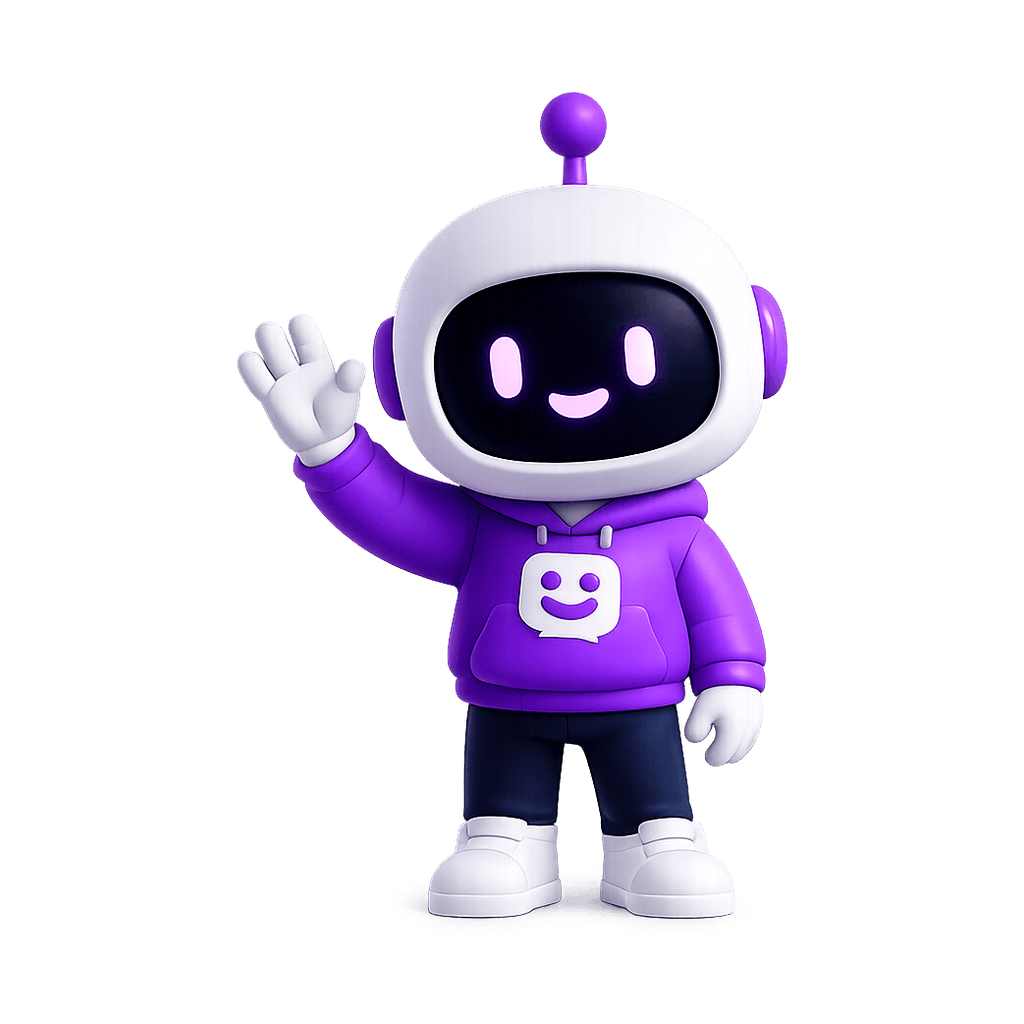
Onboarding
First impressions set the emotional tone for everything that follows. A mascot that guides users through setup — reacting when they complete a step, encouraging when they get stuck — makes onboarding feel less like a form and more like a conversation. This is where retention is won or lost, and a character makes it more likely someone finishes.
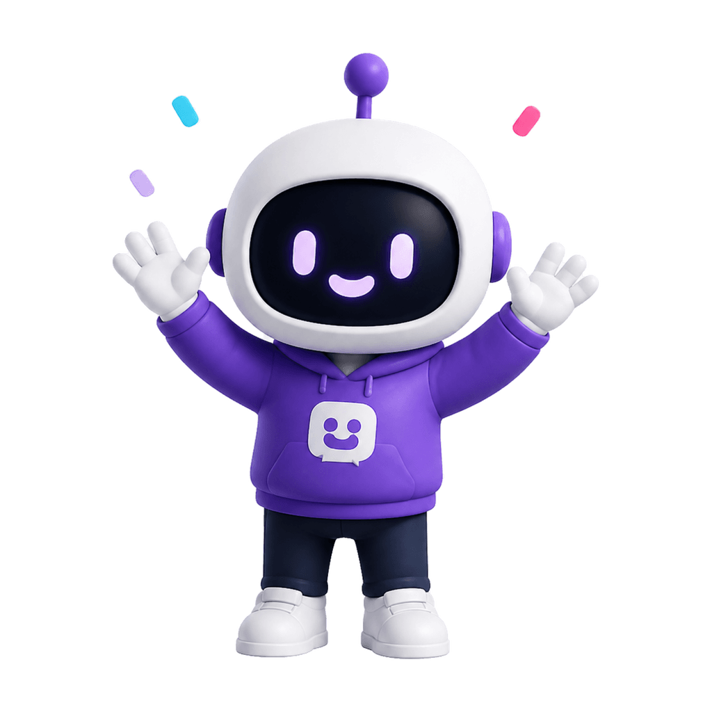
Success screens
When a user completes a purchase, finishes a task, or hits a milestone, that moment deserves more than a green checkmark. A mascot celebrating with them turns a functional confirmation into something worth sharing — or at least worth smiling at. Duolingo built a whole retention loop around this one moment.
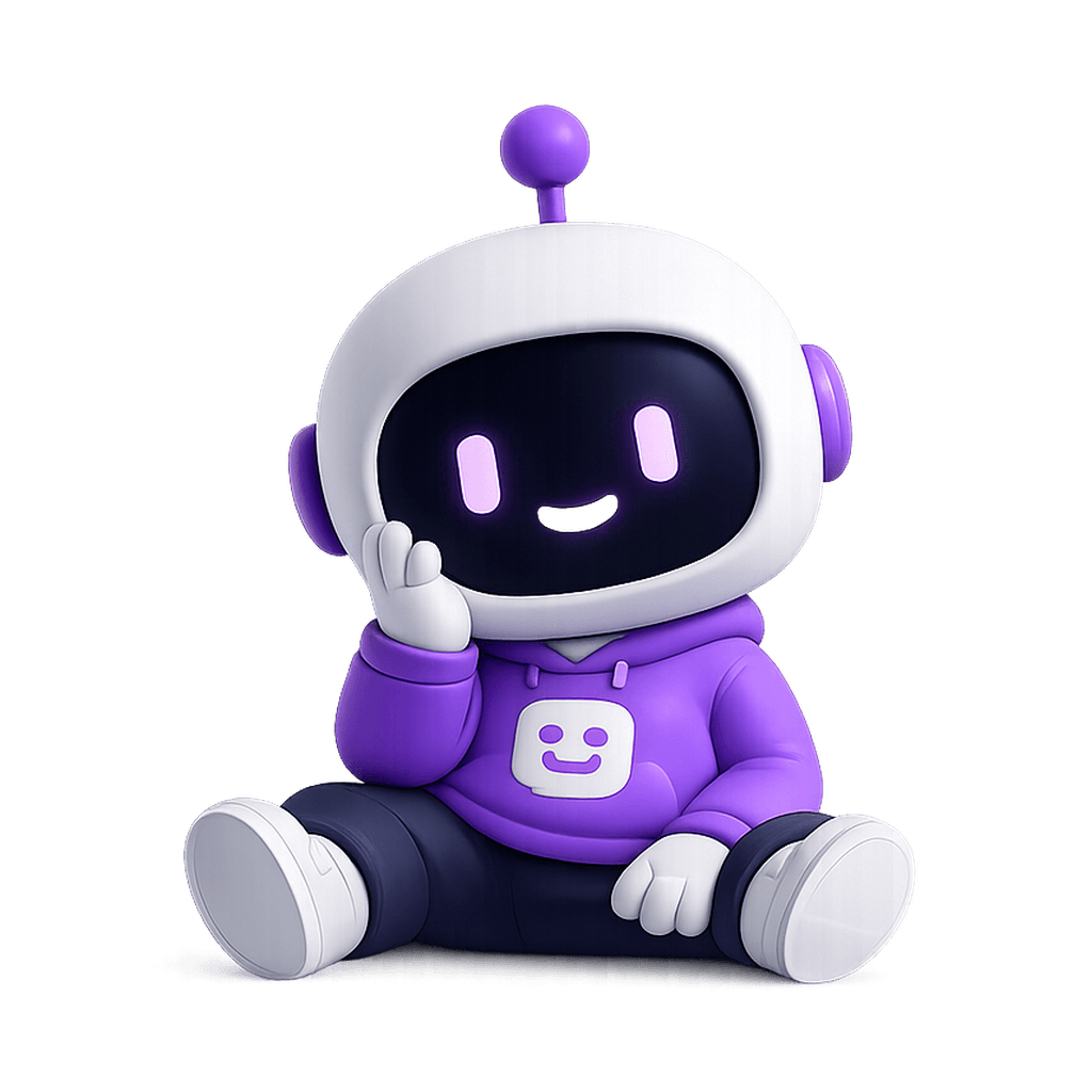
Empty states
The first screen a new user sees is usually empty — no data, no content, nothing to click. Most apps fill this with flat text that explains what to do next. A mascot in an empty state communicates the same message with personality: "Nothing here yet — but here's how to change that." It makes the space feel alive instead of broken.
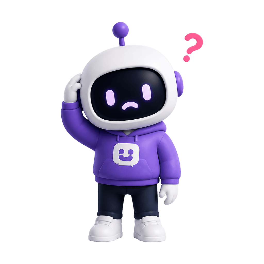
Error pages
Errors are moments of frustration. A mascot that looks apologetic, confused, or even slightly embarrassed on a 404 or 500 page turns a friction point into a brand moment. It humanizes the failure and makes users less likely to leave. It also signals that the people who built this product actually care about the experience.
Notifications and emails
A mascot that shows up in your transactional emails, push notifications, and digest digests creates continuity outside the app. Instead of a generic sender icon, users see a familiar face — one they already associate with your product. That recognition increases open rates and reinforces brand memory between sessions.
Marketing and social
A strong company mascot becomes a visual asset far beyond the product itself. It shows up in social thumbnails, ad creatives, event assets, and product announcements. Because it's recognizable without a brand name attached, it makes your marketing stand out in feeds where everything else looks the same.
What Types of Brands Can Use a Mascot?
The short answer: almost any brand that wants to feel more human. The longer answer depends on what you're building and who you're building it for.
SaaS & Developer Tools
If your product has empty states, loading screens, and error pages — which every SaaS does — you already have the placements. A mascot gives you a consistent emotional voice across all of them. A calm robot for a monitoring tool, a precise owl for an analytics platform, a curious creature for a productivity app — the character doesn't need to be literal, it just needs to match the product's energy.
Mobile Apps
Activation is the hardest problem in mobile, and most apps solve it with dry progress bars and instructions. A mascot that reacts to what users do during onboarding makes the experience feel warmer and more personal — which is the difference between someone finishing setup and someone uninstalling after three minutes.
Ecommerce Brands
DTC brands live and die by personality. A mascot for your brand can show up in confirmation emails, unboxing screens, packaging, and social — creating a visual thread between the brand story and the product experience. It's especially effective for brands targeting younger audiences who respond to character-driven content.
Startups & Early-Stage Products
Early-stage products often compete against well-resourced incumbents on features they can't yet match. A mascot is one of the few places where a smaller team can out-personality a larger company. It makes the product feel more intentional and more human, which builds trust before the product has the track record to do it on its own.
Content Creators & Newsletters
If you're building an audience, a custom mascot gives your brand a visual identity that isn't tied to your face. It shows up consistently in newsletter headers, social thumbnails, and merch — and becomes recognizable before someone even reads your name.
How to Create a Good Brand Mascot
The difference between a mascot that becomes part of your brand and one that gets forgotten in a Figma file usually comes down to process. Here's what actually matters:
Start with your brand, not the character
Before you think about what kind of animal or creature you want, document your brand clearly: primary colors, tone (playful, serious, warm, technical?), target audience, and the three words you'd use to describe your product's personality. A mascot that doesn't match your brand might look good in isolation but feel completely wrong everywhere you actually use it.
Choose the right character type
Animals, robots, humanoids, and abstract creatures carry different associations. Robots suggest precision and tech. Animals suggest warmth and personality. Humanoids create immediate relatability. Abstract creatures give you creative freedom without the baggage. Pick the one that fits your product's emotional register — not the one that looks coolest on a mood board.
Design a pose system, not a single image
A mascot that only exists in one pose isn't a mascot — it's an illustration. Plan upfront which emotional states you need: an excited pose for success moments, an empathetic one for errors, a curious one for empty states, a patient one for loading. Each pose has a different job. They all need to read as the same character.
Keep it readable at small sizes
Your mascot will often appear at 80–120px. If it's too detailed or complex, it turns into visual noise. The best brand characters are simple enough to read at a glance but expressive enough to convey emotion clearly. Test every version at small scale before finalizing anything.
Iterate before committing
Whether you're using a designer or a brand mascot generator, treat the first output as a direction, not a final answer. Push on the style, the personality, the color grounding. The first result tells you what's possible — the third or fourth tells you what's right.
How to Name Your Brand Mascot
Naming often gets rushed at the end of the process, right after the visual design is done — which is backwards. A name is half the character. Here's a framework that works better than typing "mascot name generator" into a search bar and hoping for the best:
Reflect the personality, not the species
"Fluffy the fox" describes what it looks like, not what it does. Names tied to your brand's tone (calm, playful, precise) age better than names tied to the animal or shape you picked.
Keep it short enough to say out loud
One or two syllables. You'll be writing it in onboarding copy, error messages, and push notifications; a name that's awkward to read in a sentence gets quietly avoided by your own copywriters.
Check availability before you get attached
A quick search for the domain, social handles, and existing trademarks in your industry saves you from renaming everything three months in.
Test it in a real sentence
"Ask Nova to check your calendar" either sounds natural or it doesn't. If it needs explaining, it's not there yet.
Skip the generic descriptors
"Buddy," "Helper," "Bot" are the mascot-naming equivalent of calling your app "App." They're not wrong, they're just already used by everyone else.
There's no shortcut that replaces saying the name out loud a dozen times. Once you've generated your mascot's look, run the name through this checklist before you commit to it everywhere.
Common Mistakes When Designing a Brand Mascot
Most mascot projects fail in predictable ways. Here's what to watch for:
Making it too literal
A mascot for a project management app doesn't need to hold a clipboard. A mascot for a finance tool doesn't need to wear a tie. The character communicates your brand's energy, not your feature set. Keep it conceptual — the moment it becomes illustrative of what you do, it starts to feel cheap.
Skipping the pose system
A single mascot pose is a logo element. The value of a brand character comes from using the same character across multiple UI states with different emotional expressions. If you create one image and stop there, you'll use it once — on the homepage — and never again.
Designing without your brand colors
The mascot should feel like it belongs to your brand visually, not like it was borrowed from someone else's Dribbble shot. Anchor it to your actual color palette. If the colors feel off when you place the character on your product screens, the character will always feel like a guest.
Over-designing the details
Intricate shading, complex textures, and fine linework look impressive in a full-size design presentation and become unrecognizable noise at 80px. The best mascots are clean, confident, and built to work at scale — not just in the comps.
Creating it and never using it
This is the most common and most damaging mistake. A brand mascot only becomes memorable through consistent repetition. If it lives in one place, it never becomes a brand asset — it just becomes an illustration. Use it in onboarding, empty states, error pages, emails, social posts, and anywhere else users see your product.
Related reading
Ready to try
Generate a mascot for your brand in minutes
MascotStudio is a brand mascot generator that reads your brand directly — paste your website URL, and it picks up your colors, visual style, and personality to generate a matched character. No design brief, no back-and-forth, no designer required.
You get multiple poses from the first generation — ready to use across onboarding, error states, success screens, and marketing. It's worth trying before you spend months commissioning something custom.
Preview your mascotarrow_forward